Sub Domains and mobile websites have become a thing of the past. With new Responsive Designs, you can simply have one website for all your viewers no matter the device they are looking on.
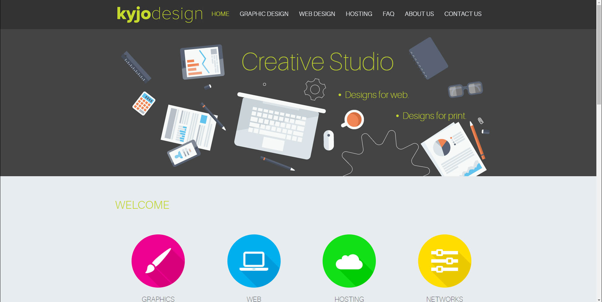
Take our website for example.
Here is a view on a small 14 inch laptop:
IMAGE HERE
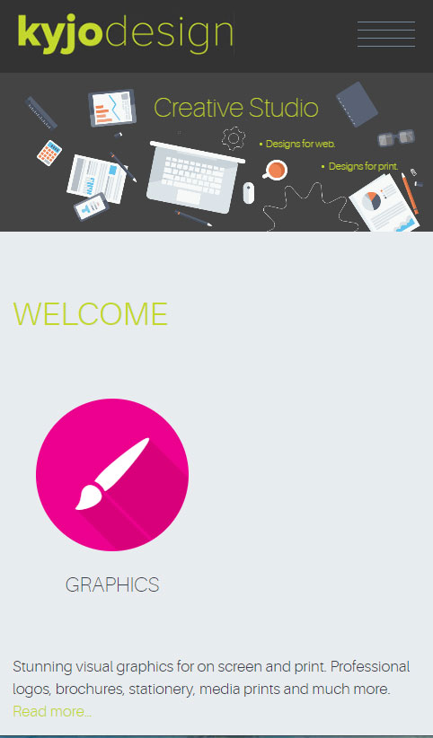
Here is a view from a tablet:
Here is a view from a mobile phone:
Please note, these will vary depending on the device and screen resolution.
No duplicate content on the web anymore! All CSS based. The benefit with Responsive designs is that you can control how the end user views all content. Whether people are on a 50 inch monitor on their PC’s or TV’s, or on their Smartphone, the website will be viewed seamless and smoothly.
We have been completing upgrades for a lot of our clients over the past 15 years and have moved from .mobile.domainname.com.au issues to our current web viewing experience. This can feel like a daunting task, but we can make the transition easy to upgrade to the current web requirements.